
What’s the “best” way to represent artificial intelligence in an icon? I only ask because the only examples I have seen in the wild are vastly different from one another, where some do better than others conveying what the heck AI is with or without an adjoining text label.
And it’s not like I have any better ideas to toss in the hat. What I do know is that icons are as tough as a stale Twinkie. They not only have to convey what is being represented but also how it fits in the current context.
Some icons are ubiquitous in the sense that they have gained widespread recognition and are commonly accepted to mean a specific thing regardless of the context they are in. The hamburger menu may be the best example of that. It wasn’t instantly recognizable as a menu when it first began appearing on websites and apps but has become perhaps one of the most familiar in use today.

AI isn’t nearly as mature a concept as navigational menus, nor have many established patterns emerged from the products that leverage it, not to say anything of how it is represented in marketing materials.
As Seen in Products
I’d say that sparkles are the most common pattern I’ve seen to date. Little stars are littering UIs all over the place.
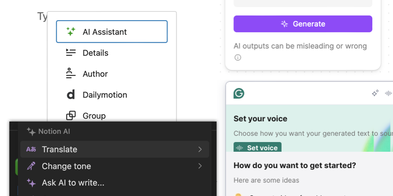
I love sparkles! I use the emoji, like, all the time, usually when commenting on how good someone’s work is. It’s quite literally the most frequently used emoji in my stack.
My hunch is that AI platforms use sparkles as a hint that something “magical” is about to happen. Press this button and we’ll handle everything for you automagically. Makes sense.
But it also doesn’t make sense. For one, sparkles imply a level of cleanliness or perfection. I don’t know if you’ve heard the news, but AI has a less-than-stellar reputation for accuracy and it has nothing to do with poor human prompts. The technology is a fantastic synthesizer of data with a catchy chat-like UI for spitting out words. The accuracy of that data, however? Questionable. It feels like a black box as there are precious few clues as to where the data is sourced, how it is evaluated against other data when it was gathered, and most significantly if it is accurate. Sure, I press the button with sparkles and something magical does appear to be happening before my eyes… but it’s just as likely to be smoke and mirrors as it is the actual information you are looking for.
There’s nothing magical about that. Once you get past the awe of what it feels like to “converse” with technology, the glitter wears off and it all starts to feel like a glorified version of autocomplete. I’m not saying that to offhandedly dispel AI as a concept — hey, it could be useful for many things! — but magic it ain’t, and perhaps sparkles ain’t the best representation of it.
The loud cynic in my head wants to believe that sparkles are a marketing ploy to make something feel more special than it is — Check out this new and magical thing we have for you — and that we ought to stick to using sparkles to indicate a “new” feature that is dropped once the feature gains awareness and no longer needs a visual to highlight it in the UI.
As Seen in Web Searches
Have you ever done an image search for “artificial intelligence icon” in Google, DuckDuckGo, or whatever it is you use these days? It’s pretty hilarious.
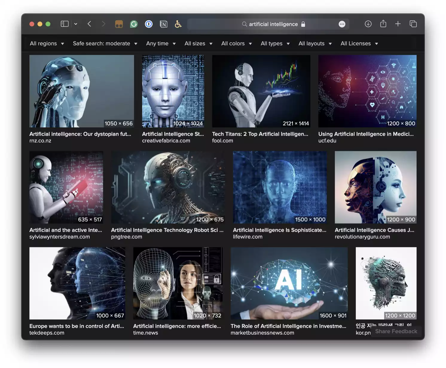
I did several variations of the search as I think it’s a decent look at the zeitgeist of how we (yes, the collective, royal We) interpret AI as a concept. It’s lots of robots, or cyborgs perhaps more accurately. It’s filled with digital matrices offering glimpses into unknown realities and dimensions that were once unseen by the naked human eye. It’s a web of interconnected nodes that not only make cyborgs smarter, but more humanlike to the extent that there’s little distinction between humans and machines. It’s a scene stripped right out of Avatar and an ethereal experience that alters the bounds of reality.
I only include this because I think it’s helpful context for many other types of AI-flavored iconography that are making rounds.
As Seen in Design Resources
Of all the icon collections, icon repositories, icon stores, and icon portfolios I scoured online, I was at first overwhelmed by the sheer number of available options. You need to look no further than Noun Project to see what I mean.
But once my mind took in the first, I dunno, one thousand icons I started noticing that the options are a lot less plentiful than I initially thought. That’s because the super major vast majority of icons seem to fall into one of several recurring themes.
First and foremost are human heads.
It’s the whole man-meets-machine theme. The head, I assume, is the intelligence, but where a brain ought to be, are implanted cogs, interconnected nodes, and computer chips. Quite literally human intelligence swapped out for an artificial flavor.
That could work! The thing that troubles me, though, is two-part:
- Imagine how tough it would be to display that level of detail in a much smaller, say, 32×32-pixel space. Those cogs, nodes, and chips are easily lost when any of those icons are downscaled.
- Just dang creepy. It’s the Uncanny Valley in all its glory.
There must be a better AI representation out there. Oh yes, robots!
I’m going to straight-up dismiss this theme outright. A robot can mean so, so, so many things. A robot in a chat bubble? Could be an auto-reply just as easily as a conversation with an algorithm. Rpbit with nodes popping out its head? Could be a fried bot that’s been decommissioned. Robot busting out of a split human head? Luke, I am your father. And all I do is giggle at the romantic pairing of a robot and a woman together in a loving embrace. Let’s not get the culture police involved!
Brains might be the most represented icon I found, next to human heads. It’s very much the same concept, only maybe a little more effective as far as being able to show more detail at downscaled sizes, at least in some cases — that one in the bottom-left is most certainly too detailed for practical use. A brain in a box might be the most straightforward and clean approach, but also isn’t a clear indication that this is a technology that synthesizes data. The biggest issue with it, though, is that it conveys “thinking inside the box” as much as anything else.
I will say that I quite like the three cubes connected to a brain because they indicate the interconnected components that make AI possible — i.e., LLMs, APIs, and integrations. I could see that working in some UI, like a navigational menu. It’s not sexy like sparkles but gets the job done sans smoke and mirror marketing innuendo.
Check these out:
This is another set that I’ll dismiss outright. I get the idea that the interconnected nodes are AI components — never mind what additional elements are tossed in the center of the shape — but isn’t there already a super popular JavasScript library out there with a logo that looks awfully similar? And isn’t this shape also used in physics to represent atoms? That makes me think of Big Bang Theory.
The last recurring theme of AI-related icons I found is back to sparkles. If I came across as anti-sparkle, it’s only because sparkles alone feel disingenuous. But if they’re paired with something else, well, perhaps that’s better. Let’s look.
While I do not think that any of these examples are silver bullets on their own, I like the idea of incorporating sparkles on the thing that performs automagical tasks. The sparkle on an envelope is an excellent indication that you can do something auto-something in email. Then again, the thing that sparkles are paired with needs to be super specific. See the computer screen with a sparkle? Is that simply a brand-spanking new monitor with an ultra-clean screen? It could be. But an icon of a file with a sparkle on it might work to suggest that you’re about to auto-summarize text in a document or something.
So…?
I dunno, I’m no trained designer even though I play one in my day job. If I were tasked with finding an icon that can be used to label an AI-related feature in a UI component, I’d likely pursue a set of icons more closely tied to the feature itself, such as the sparkle-donning envelope for AI-flavored email features. The sparkle is what suggests automation and whatever it is applied to it is the feature. Sparkles alone can mean too many things (and reek of marketing cruft).
But again, what the sparkle goes onto has to be super specific. The example of a computer monitor with a sparkle is just as much saying you’re about to buy a shiny new personal computer as it is that something has AI baked into it.
Some of this isn’t specific to AI but to iconography in general. The detail needs to be clear enough to convey meaning, but not so detailed that the meaning is lost when downscaled. The elements need to be recognizable at first glance but also avoid crossing into well-known commodities, like how the helix shape closely resembles the logos of React and The Big Bang Theory. The subject matter has to steer clear of creepy connotations or else suffer the fate of Uncanny Valley. These are all considerations to take into account when working with icons of any kind.
What are you using in your UI designs?
6 Comments
@geoff Ha, I ran into this problem when picking the icon I wanted to use for my “generative AI” tag on https://benmyers.dev/tags/ – I ultimately landed on a little robot head with a speech bubble.
One issue I found was that a lot of the icons that focused on communicating some sort of cybernetic cognition felt like they really oversold the capabilities of the tooling in a way that I really didn’t feel like contributing to.
All Tags
@ben Yes, THAT! 💯 I hate the way sparkles have been co-opted because my inner pessimist believes it’s more marketing than good UI/UX.
Saw this on Mastodon today:
https://freeradical.zone/@sohan/113215739720299019
Likes