CSS-Only Accordion Using the Checkbox Hack
A client recently asked for an accordion in one of the designs I was working on, so I want to share how I tackled that using a CSS-only solution.
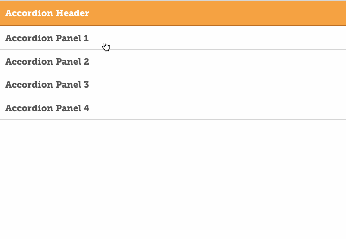
Even if you haven’t heard of an accordion, you’ve likely seen one on a website at some point in time. The concept is pretty simple: a series of panels that expand and contract when clicked. We call it accordion because that’s the way it looks when it toggles between opened and closed states.
Getting that toggle effect is something that has traditionally been accomplished with Javascript or jQuery. In fact, that’s what jQuery is really good at: select that element and make it do this thing!
CSS also has a way of selecting elements and it’s known as the Checkbox Hack. CSS Tricks has an incredibly comprehensive post that explains the Checkbox Hack concept and provides a gazillion examples of how to use it, so I won’t even bother rehashing it. The basic idea is that we use the checked and unchecked status of checkboxes in forms to change the styling and layout of those elements without using Javascript or jQuery.
Why would we want to do that? It’s true that this is what jQuery was made for, but if we can do something without it, and manage the functionality and styles in place, then I’m all for it!
Setting up the HTML
Here is the structure we will be using for the HTML:
<div class="accordion">
  <ul class="accordion__wrapper">
    <li class="accordion__header">
      <h1>Accordion Header</h1>
    </li>
    <!-- accordion__header -->
    <li class="accordion__item"><input checked="checked" type="checkbox"> ^
      <h2>Accordion Panel 1</h2>
      <div class="panel">
        <p>Your content</p>
      </div>
      <!-- panel -->
    </li>
    <!-- accordion__item -->
    <!-- Repeat as many of those panels as you want... -->
  </ul>
  <!-- accordion__wrapper -->
</div>
The pattern is basically this: Accordion > Wrapper > Header > Item > Panel.
Do you see the <input type="checkbox" checked> line in there? That’s the checkbox that, when clicked, will trigger our panel to open and close. We’re turning the entire panel into a giant checkbox, hiding the actual box using CSS, then opening and closing the panel based on whether the checkbox has been clicked.
Setting up the CSS
Let’s set up the basic structure for our CSS, then fill it in step-by-step.
.accordion {
  // The class that wraps our items
  &__wrapper {}

  // Shared styles between the header and item classes
  &__header, &__item {}

  // The accordion header
  &__header {}

  // The wrapper around each panel
  &__item {

    // The accordion icon
    span {}

    // The checkbox, checked and open by default in the HTML
    input[type=checkbox] {

      // When checked...
      &:checked {

        // ...close the panel...
        &~div.panel {}

        // ... and rotate the icon
        &~span {}

      }  // end :checked
    } // end input[type=checkbox]
  } // end __item
} // end .accordion
Style the Main Container
Now that we’re set up, let’s start writing some styles! The first step is to set up the .accordion class and define some variables we will use throughout the component.
.accordion {
  // Our Reusable Variables
  $accordion-border-radius: 4px; // the rounded corners
  $accordion-border-color: #eaeaea; // the border color
  $accordion-padding: 15px; // a number we'll use for spacing
  $accordion-heading-color: #ff9e2c; // header background color
  $accordion-icon-color: #ff9e2c; // the color of the icon

  margin: 0 auto; // this will center the accordion
  width: 50%;
} // end .accordion
Style the Accordion Wrapper
Our parent container is set so the entire accordion takes up 50% of the screen and is positioned horizontally in the middle. Now we need to style the accordion wrapper so the panels take up 100% of the parent container and removes the default styling of <li> list items.
.accordion {
  // The class that wraps our items
  &__wrapper {
    border: 1px solid $accordion-border-color; // the border around the accordion
    border-radius: $accordion-border-radius; // our rounded cormers
    list-style: none; // remove bullet points from list items
    margin: $accordion-padding 0; add some space between the accordion and other components
    width: 100%; // make sure the panels take up the full width of the parent
  }
} // end .accordion
Style the Header and Panels
Now we can start adding styles to the accordion header and the panels that will open and close.
.accordion {

 // ...

 // Shared styles between the header and item classes
  &__header, &__item {
    float: left; // make sure the items stack
    padding-left: $accordion-padding; // breathing space
    padding-right: $accordion-padding;
    padding-top: $accordion-padding;
    position: relative; // is important for containing our icon
    width: 100%; // take up the full width of the container!
  }

  // The accordion header
 &__header {
    background: $accordion-heading-color;
    border-bottom: 1px solid darken($accordion-heading-color, 20);
    border-top-left-radius: $accordion-border-radius;
    border-top-right-radius: $accordion-border-radius;
    color: #fff;
    padding-bottom: $accordion-padding;
  }

  // The wrapper around each panel
  &__item {
    background: #fff;
    border-bottom: 1px solid $accordion-border-color;
    margin-bottom: 1px; // makes the bottom border visible
    padding-bottom: $accordion-padding / 2;

    &:last-of-type {
      border: 0; // no need for a border since the wrapper has one
      border-radius: $accordion-border-radius; // complete the rounded corner effect
      padding-bottom: 0;
    }

    // The accordion icon
    span {
      color: $accordion-icon-color; // matches the accordion header
      margin-top: $accordion-padding;
      position: absolute; so we can position it precisely
      right: $accordion-padding;
      top: 0;
      transition: all 0.2s ease-in; // will rotate when checkbox is unchecked
    }
  }
} // end .accordion
Add the Checkbox Hack
We still haven’t done anything with the checkbox, so let’s tackle that. We’re going to hide it with absolute positioning and changing it’s transparency to zero. Then, we’re going to set the styles for the when the checkbox is checked.
.accordion {

  // ...

  // The wrapper around each panel
  &__item {
    // The accordion icon
    span {
      color: $accordion-icon-color; // matches the header background color
      margin-top: $accordion-padding;
      position: absolute; // allows us to position it precisely
      right: $accordion-padding; // adds room between the the icon and border
      top: 0;
      transition: all 0.2s ease-in; // will when checkbox is unchecked
    }

    // The checkbox, checked and open by default in the HTML
    input[type=checkbox] {
      position: absolute; // move the checkbox out of the way
      cursor: pointer; // use a cursor instead of a pointer on hover
      width: 100%; // makes the entire panel clickable
      height: 100%; // makes the entire panel clickable
      z-index: 1; // brings the checkbox to the top of the everything else
      opacity: 0; // makes the checkbox invisible

      // When checked...
      &:checked {

        // ...close the panel...
        &~div.panel {
          float: left;
          margin: 5px 0;
          max-height: 0; // no height
          opacity: 0; // no visibility
          transform: translate(0, 50%);
        }

        // ... and rotate the icon
        &~span {
          transform: rotate( 180deg );
        }

      }  // end :checked

    } // end input[type=checkbox]

  } // end __item

} // end .accordion
In Conclusion
Look mom, no Javascript! That’s how we make an accordion just with CSS using the infamous checkbox hack. The final result will look something like this:
See the Pen Simple Accordion with Checkbox Hack by Geoff Graham (@geoffgraham) on CodePen.
Please note that that the checkbox hack is exactly that: a hack. It’s nice, but browser support starts getting janky in early version of IE and Android. If you need to support those browsers, there ain’t nuthin’ wrong with a little bit of jQuery for the benefit of cross-browser compatibility. :)
2 Comments
Hi Geoff,
Thank you so much for this tutorial, it’s definitely the clearest and most straightforward explanation of the CSS accordion that I’ve found! However, I have a question about adjusting the height of the accordion items. I tried to move the items closer together by changing the height property on .accordion__item, to 25%, but that didn’t seem to change anything. I then adjusted the height to 1rem, which changed the height, but when I did so, something got screwed up with the panels, where the panels didn’t push the items below it down, but rather just appeared overlayed on top of the items below it. Would you be able to help me figure out how to correct this? Thanks!
Hey Jake! I’ve gotta hand it to you: I hadn’t updated this post in a long time and you put up with a bunch of wacky code formatting that I just fixed. Sorry about that!
There’s some padding going on in there that, if removed, will bring things closer together. You’ll find those in Lines 58 and 77 of the final demo.
Comments are closed.