
The flat design trend is forcing designers to think of new ways to create depth and texture. That’s why I really like the new iTunes Radio technique of stacking image covers. It generates the illusion of layers without the typical use of drop shadows and gradients.
But how do we create this in web design? I used this technique in a recent project and will walk through how I did it in this post.
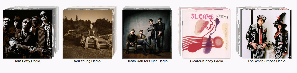
For those of you who haven’t seen the new iTunes Radio interface, this is what we’re going to re-create:
Let’s start stacking!
Setting up the HTML
We have seven images layered on top of each other. I think the best way to go about this is by creating seven elements with background images. Theoretically, we could just drop seven image tags into our HTML, but writing the image URL once in CSS sounds much more maintainable to me.
For this exercise, I’m going to use HAML to cut my HTML markup down even more. I’m no expert on HAML, so I’m sure there is an even easier way to do this. If so, please share!
%ul
  %li
    - (1..7).each do |i|
      %img{:class=>"covers cover-left-#{i}"}
  %li
    - (1..7).each do |i|
      %img{:class=>"covers cover-center-#{i}"}
  %li
    - (1..7).each do |i|
      %img{:class=>"covers cover-right-#{i}"}
All this is doing is creating an unordered list with three list items. Each list item generates seven img tags with class covers and another class, which we will use to designate the direction of the stacking.
What is the #{i}? That is HAML’s way of appending a number at the end of the class name for as many iterations that are in the loop. In this case, there are seven iterations, as specified in the first line for each list item.
Is it weird that I’m using an img tag without actually defining an image? Yes, it really is. It would certainly make more sense to use another unordered list here instead, but hey, this just a tutorial to get a point across. Feel free to up the ante!
Create Our Columns
Now let’s set our unordered list so the items stack next to each other.
ul { width: 1000px }

li {
  display: inline-block;
  float: left;
  list-style: none;
  position: relative;
  margin-top: 5%;
  width: 33%;
}
All we’ve done here is set our list items up as three columns that stack next to each other from left to right. These will be the containers that we drop our stacking images into for each album cover.
Set Our Album Covers
Next up, we are going to define the background for each img. Each cover will repeat seven times, thanks to the HAML function.
img[class*="cover-left-"] {
  background: url('http://cl.ly/SMDt/horses.jpg');
}

img[class*="cover-center-"] {
  background: url('http://cl.ly/SM5y/beatles.jpg');
}

img[class*="cover-right-"] {
  background: url('http://cl.ly/SM8Y/breeders.jpg');
}

img[class*="cover-"] {
  background-size: cover;
  top: 25%;
  position: absolute;
}
All we’ve done is define a background image for the img tags in each container. At this point, each container will consist of seven repeating background images, though they will be out of position.
The last element sets every background to the exact size of the img container and positions the tags absolutely so we have more control over the stacking position.
Position the Covers
iTunes does this neat thing where albums on the left stack diagonally toward the upper left, albums in the center stack vertically straight up, and albums on the right stack vertically toward the upper right. It’s a neat way to add depth and perspective.
Let’s position our stacks so they flow in the direction of the side they are on.
$class1: cover-left !default;
$class2: cover-center !default;
$class3: cover-right !default;
$square: 250px;

@for $i from 1 through 7 {
  .#{$class1}-#{$i} {
    height: $square  - $i;
    margin-top: -5px * $i;
    top: 1px * $i;
    width: $square - $i;
  }
}

// Repeat this for variables $class2 and $class3
...
This is where the magic happens, but also where things get a little complicated. In order to position the stacked images, we need to tell them where to go. In this case, each background stacks upward vertically. So, the code does three things.
First, it defines variables for each of the image classes in our HTML and a numerical value that we will use for the height and width of our album covers.
Secondly, it uses the Sass @for function, which allows us to repeat the same styles in a loop for each class in the series. This has the benefit of not having to repeat ourselves in our code, which is why we all should be praying to the Sass gods right this second. In this case, we have set a loop for seven interactions, which matches our HAML loop.
Lastly, it defines the size of of our album cover using the $square variable and positions each img so it stacks evenly above the layer in front of it.
Let’s Get All Dimensional
So right now, our backgrounds stack upward, but they are all on the same plane. In other words, there is no stacking illusion because we haven’t told them how to stack. So let’s do that by adding a z-index to our function.
$class1: cover-left !default;
$class2: cover-center !default;
$class3: cover-right !default;
$square: 250px;

@for $i from 1 through 7 {
  .#{$class1}-#{$i} {
    height: $square  - $i;
    margin-top: -5px * $i;
    top: 1px * $i;
    width: $square - $i;
    z-index: 7 - $i;
  }
}

// Repeat this for variables $class2 and $class3
...
That tells our images to stack themselves one front of the other, assigning each with a layer number 1 though 7, counting backwards from the first image. That way, the first image gets the highest layer, followed by the next. And so on…
One Last Detail
Notice how the iTunes covers fade with each layer? Let’s make that happen by adding the opacity attribute to our function.
$class1: cover-left !default;
$class2: cover-center !default;
$class3: cover-right !default;
$square: 250px;

@for $i from 1 through 7 {
  .#{$class1}-#{$i} {
    height: $square  - $i;
    margin-top: -5px * $i;
    opacity: 1 - ($i * .1);
    top: 1px * $i;
    width: $square - $i;
    z-index: 7 - $i;
  }
}

// Repeat this for variables $class2 and $class3
...

img:nth-child(1) { opacity: 1; }
Opacity is measured in tenths, so I set it up to subtract 10% opacity from each layer progressively. Then, I added another element targeting the first child of each column that sets the first layer opacity to full. Now, we have the illusion of the stack slowly fading as it gets deeper!
Wrapping Up
If you haven’t noticed, this only creates the a stack that move vertically upward, but not left or right. To get the effect for each side, repeat the function for each $class variable, setting the left and right attributes accordingly. Here is my final output.
[codepen_embed height=”372″ theme_id=”279″ slug_hash=”fxyvz” default_tab=”result”]See the Pen iTunes Radio Style Covers by Geoff Graham (@geoffgraham) on CodePen.[/codepen_embed]