
Miriam Suzanne and James Stuckey Weber sat down to talk CSS Anchor Positioning, one of those things I’m certainly aware of by nature of what I do for a living but have not bothered to dedicate time to. Miriam’s been aware of the feature from the spec side of things, of course, but James has been in the field playing with it.
This is the kind of video I’m a sucker for: two great folks learning together, asking questions, and doing it all without a script. Fits my mental model and all.
Anyway, I thought I’d jot a few notes I’m taking away from the video as I watch it.
The video
The general concept
- It looks a lot like absolutely positioning elements relative to another element.
- We’re effectively “pinning” an element to another the way we might “pin” a message on a social profile, but gain positioning capabilities.
- But rather than saying “pinning” it’s more like we’re dropping “anchor” from an element that’s a “boat” in another element that’s the “sea” and we get to determine the tethered position of the boat in that water with the anchor keeping us from floating out of flow.
- Another way of placing things on the screen, but it used to require JavaScript to do this exact sort of thing.
- Fixed positioning is anchored to the viewport; this way, we’re able to anchor to a specific element on the page. One element is in a place and we want to positioning another element in relation to it.
- Only supported in latest Chromium at time of video.
Feeling around the syntax
anchor-name:Define the element to anchor to, declared on that element. Takes a dashed-ident value like a custom property.position-anchor:The element dropping the anchor for positioning.
From here, we could absolutely-position the element we want to position the element dropping the anchor.
h1 {
anchor-name: --post-title;
}
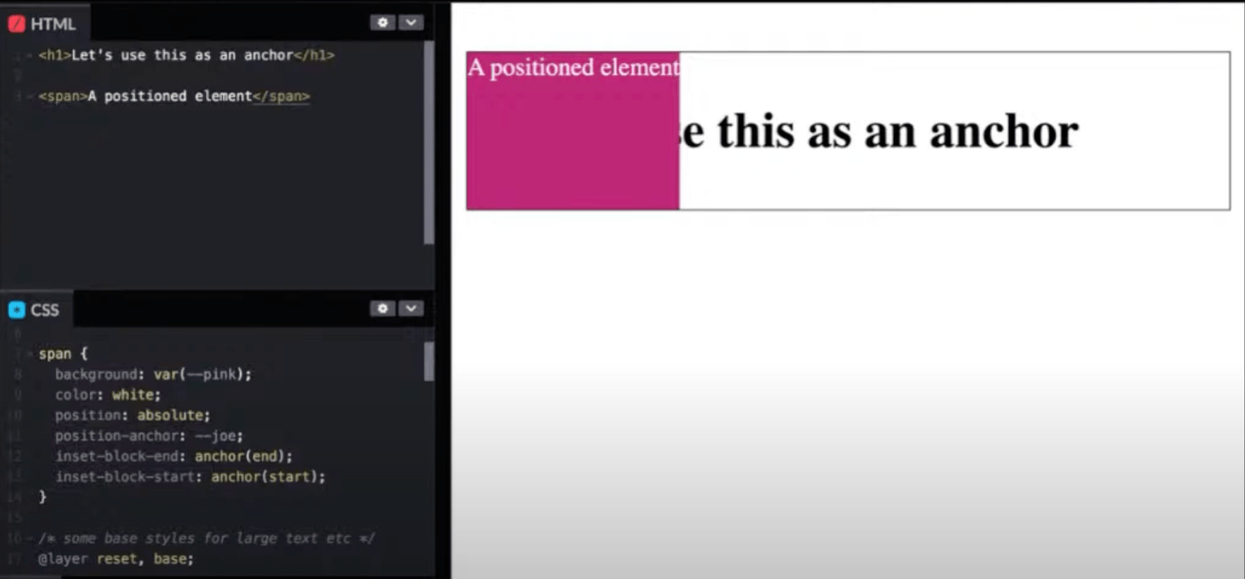
span {
position: absolute;
position-anchor: --post-title;
}Like any other positioning method, we inset with physical — top, bottom, etc. — or logical properties — inset-block-start, inset-inline-end, etc. But we do it in an anchor() function.
h1 {
  anchor-name: --post-title;
}

span {
  position: absolute;
  position-anchor: --post-title;
  inset-block-start: anchor(start);
}
The function accepts physical (e.g. bottom) and logical (e.g. end) keywords.
We can do without position-anchor entirely and reference the named anchor in anchor():
h1 {
  anchor-name: --post-title;
}

span {
  position: absolute;
  inset-block-start: anchor(--post-title start); /* ✨ */
}
It doesn’t seem to accept logical property values in full, e.g. inset-block-start, which James says could be a bug on the spec or implementation side.
/* 👎 */
inset-block-start: anchor(--post-title inset-block-start);
I wouldn’t be surprised if that’s intentional behavior. It’s weird to declare, for example, inset-block-start in and anchor() on the inset-block-start property like shown above. Instead, the property:value pair reads more logically:
/* "Anchor the element's top edge with the anchor's starting edge */
top: anchor(--post-title start);
inside and outside anchors
Instead of start and end we can position an element inside and outside the anchor.
inset-block-start: anchor(--post-title inside);The inside value refers to the same side as the property (inset-block-start in that example) where outside refers to the opposite side as the property (inset-block-end in the example). But it also appears not be implemented at this time, at least in the example shown in the video.
Multiple insets, same anchor
h1 {
  anchor-name: --post-title;
}

span {
  position: absolute;
  position-anchor: --post-title;
  inset-block-start: anchor(end);
  inset-block-end: anchor(start);
}
This positions the element in multiple directions, allowing it to span the area.
A faster way to do this: position-area:
h1 {
  anchor-name: --post-title;
}

span {
  position: absolute;
  position-anchor: --post-title;
  position-area: left;
}
Anchor sizing
Another handy lil’ function: anchor-size().
h1 {
  anchor-name: --post-title;
}

span {
  position: absolute;
  position-anchor: --post-title;
  top: anchor(bottom);
  min-height: 1.5em;
  width: anchor-size(width);
}
Notice what’s happening here. We’re not only positioning the element in relation to the anchor but also sizing it with the width property. This is effectively saying, “Hey, take this element, make it at least 1.5em tall, and make it as wide as the thing it’s anchored to.
🤯
This seems like something I’ve often tried using flexbox for — stretching items across a relative space and fixing them to a specific spot. I’m already thinking of this for things like lower-third caption overlays on images, sticky headers/footers, icons and labels…
Works with calc():
height: calc(anchor-size(width / 2));
inset-inline-start: calc(anchor-size(center) + 10cqi);
The consensus is less certain when it comes to nesting anchor-size(). It appears to be unallowed, maybe because they are not computed values that can be used for calculations?
/* 👎 */
height: calc(anchor-size(width / calc(anchor-size(height))));
Inspired by the Popover API
The idea being that we can anchor to something, say, a button.
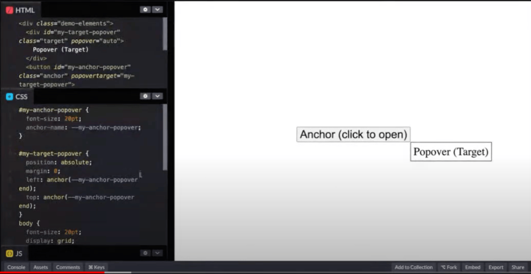
The example in that screenshot can be optimized a bit with inset-area, but then we have to explicitly reference the anchor we’re positioned to.
/* before */
top: anchor(--post-title end);
left: anchor(--post-title end);

/* after ✨ */
position-anchor: --post-title;
position-area: end;
Anchor scope
Interestingly, we can set reference the same anchor to a class used on several items, like items in a list:
<ul>
  <li>
    <div>Item 1</div>
    <div class="anchor">#</div>
    <div class="target">Target</div>
  </li>
</ul>

li {
  anchor-scope: --list-item
}

li .anchor {
  /* the anchor scope is <li> */
  anchor-name: --list-item;
}
The .target is looking up the DOM tree for the nearest ancestor with that anchor name, so all of the targets in this example stay within the scope of a list item, providing wholesale positioning across the entire list of items. No need to give each list item an anchor name!
Custom properties
.anchor {
  anchor-name: --my-anchor;
}

.target {
  --size: anchor-size(width);

  position: absolute;
  position-anchor: --my-anchor;
  width: var(--size);
}position-try?!
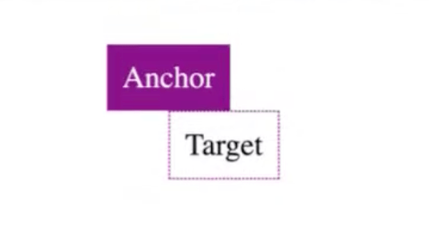
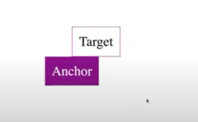
Whoa, a little algorithmic logic with positioning when running out of room in a scroll container.
.anchor {
  anchor-name: --my-anchor;
}

.target {
  position-anchor: --my-anchor;
  position-try: flip-block;
  bottom: anchor(top);
  left: anchor(center);
}
The .target is positioned above the anchor, where it’s ending (bottom) edge is touching the starting edge (top) of the .anchor. When the target reaches the top of the scrollport and is about to leave view, CSS will attempt to flip the .target inb the block direction, moving it so that its starting (top) edge is touching the ending (bottom) edge of the .anchor to keep it in view as long as possible.
Values:
flip-blockflip-inlineflip-start(combines block and inline)flip-end(combines block and inline)
And it’s a two-value syntax, not unlike setting background-repeat in both directions but we’re working with directional-awareness instead.
position-try: flip-inline, flip-block; /* needs the comma(?) */I can see that being a popular snippet.
Set position-try preferences with position-try-options
One more thing we can drop from JavaScript! If we need even more control, there’s position-try-options for setting the flip behavior in any given direction in the order you want in conjunction with a new @position-try at-rule:
.target {
  position: absolute;
  position-anchor: --my-anchor;
  position-try: --on-bottom-right, --on-top, --on-left;
}

@position-try --on-bottom-right {
  top: anchor(bottom);
  left: anchor(right);
}

@position-try --on-top {
  bottom: anchor(top);
  left: anchor(left);
}

@position-try --on-left {
  right: anchor(left);
  top: anchor(top);
}
It also works with inset-area, of course, for cleaner code:
@position-try --on-bottom-right {
  position-area: bottom right;
}
More properties types this is compatible with besides inset-area:
insetpropertiesmarginproperties- sizing
- self-alignment
position-anchor
Can we also change what we are anchored to since this works with position-anchor? It seems it would, but also doesn’t appear to be implemented, so 🤷♂️.
Good lord, thinking tooltips here.
position-try-order ‼️
Sorts the position-try-options order by what has the most width, height, inline-size, block-size, etc.
position-try-order: most-width;Anchor to anything!
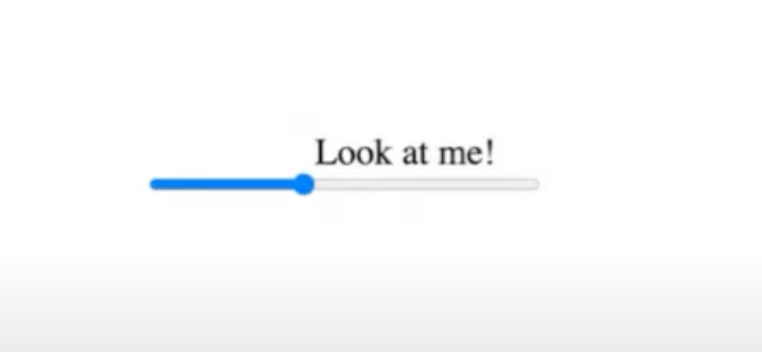
It’s possible to anchor to anything with a CSS anchor-name. I love this example of text on a <progress>:
Heck, anchor to multiple things!
.target {
  position: absolute;
  top: anchor(--anchor-1 bottom);
  bottom: anchor(--anchor-2 top);
  left: anchor(--anchor-3 right);
  right: anbchor(--anchor-4 left);
}
The .target is effectively positioned in a way that spans multiple anchors, allowing its shape to flex all around.
I stopped the video with 10 minutes to go, so I’m sure there’s much more to glean there, but I’ll have to come back to it.
Resources
- Una’s anchor-tool.com is a great interactive demo of the options.
- James’s collection of examples on CodePen.
Changelog
- September 11, 2024: Updated the
inset-areaproperty to its new name,position-area, in the examples. A roundup of other changes to the Anchor Positioning API syntax can be found in Una’s post as well as this one on CSS-Tricks.
5 Comments
Even in Chrome (latest) where the CodePen demos work fine, anchor positioning is still a struggle on my own test suite. DevTools keeps telling me for “position-anchor: –name;” that –name is undefined, despite very clearly having “anchor-name: –name;” set for its parent. I’ve tried everything from explicit position-area, to setting parent position: relative and/or display: block, but no joy. Wish I had more tools to diagnose the situation. Can’t wait for broader adoption!
Likes