I love getting emails marketing in my inbox. I love it so much, in fact, it makes up more than half (OK, three-quarters) of emails I get on an average day.
Yes, three out of every four friends I have are the ones I sign up for on corporate websites.
So getting a Merry Christmas email from my BFF Starbucks really brightened my day when I saw the subject line sitting in my inbox.
(Actually, it was a Season’s Greetings email but I don’t let that ruin the Christmas spirit for me.)
Email greetings are an excellent alternative to the traditional card, though they have to be done extremely well to make up for the feeling of getting something you can hold and show off on the fridge.
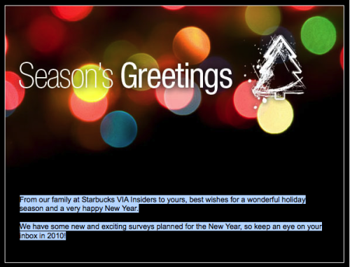
That said, the email I got (pictured above) was really disappointing and took the egg out of the nog on a number of levels.
Design
Sure, I love the imagery (and will be changing my blog’s background image right away) but there is nothing here that tells me this is from Starbucks. I signed up for Starbucks emails but would no idea if they really designed this or some cousin I rarely talk to did. Just change the From field in the email and this could have come from anybody.
Lack of Personalization
I’m guessing Starbucks has a heaping pile of information about all their customers. Even if they don’t they should at least have my first name and make the small effort to put it in the copy.
There’s no better feeling than recognition in a brand-to-customer relationship and calling someone by their first name in a holiday email is the least a brand can do to foster that relationship.
No Call to Action
My hat is actually off to Starbucks for creating a truly selfless email during the most consumer-driven season of the year. There is no advertisement, gimmick, product, service or any sort of sales pitch going on here.
Kind of refreshing, but also kind of pointless.
I gave Starbucks permission to sell stuff to me when I opted into their email list on their website. Because of that, I really expect to see something of value each and every time they contact me. Unfortunately, there’s nothing here for me to be merry about—a free drink coupon, special discount when ordering online or even a link to print the email if I really want to hang it on my fridge—by the way, I don’t but would consider it if the email interacted with me a little more.
Content
If you haven’t noticed by now, I purposely highlighted the text in the image because otherwise would be invisible. That’s right, black text on a black image on a brandless email that has no other call to action than to wish me a happy holiday. This could be filed under Design Grievances, but if there was some additional content or products to feature, this may not have been the blunder it appears to be.
Season’s greetings, Starbucks. I appreciate the sentiment but could have probably done without.
