
One of the new features I added to this site when I redeveloped it was a responsive bar chart. It’s helpful for visualizing my skills as a designer and developer, but it could also be helpful for lots of other things, say touting your ninja skills or rating your favorite bands from the 80s. I’ll give a brief explanation of how I created it.
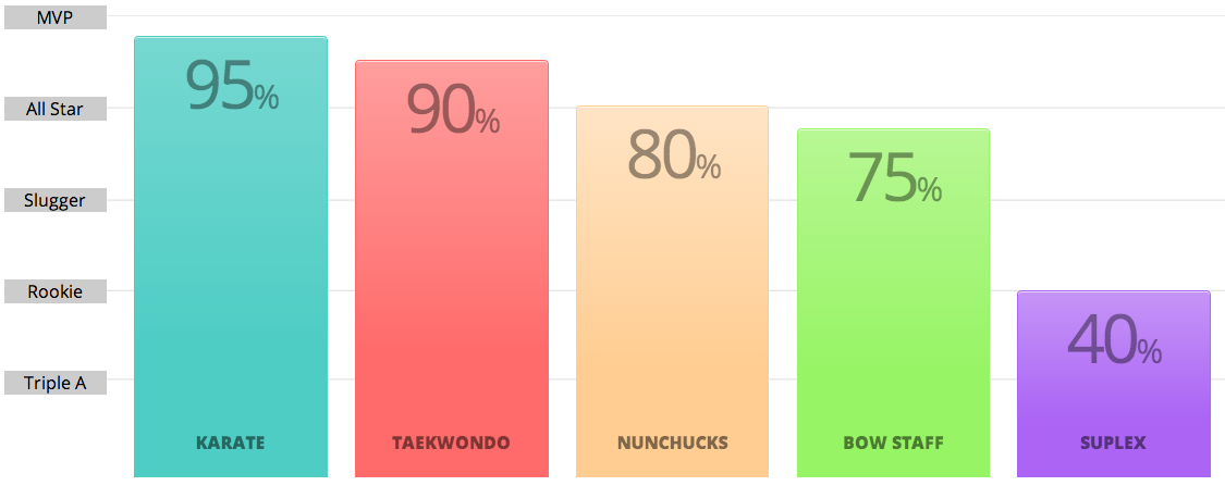
At the end of this, we should end up with something that looks like this:
Start with an unordered list
The entire chart is basically an unordered list. That means our HTML is pretty basic.
- 95%
- 80%
- 75%
- 40%
Let’s add a y-axis
So far, this will provide us with the bars, along the x-axis, but no y-axis. And, let’s face it, any chart without a scale is pretty sucky. So let’s add one.
-
MVP
All Star
Slugger
Rookie
Triple A
- 95%
- 80%
- 75%
- 40%
Now we have something to measure the height of our bars against. We’re wrapping these values in a list <li>
tag to make it part of the ordered list, but then individually wrapping each one in a div class .label so we can style them separately without affecting the rest of the chart. Basically, the labels have to stack vertically while the bars stack horizontally, so that’s what we’re doing here.
Let’s get some styles up in here
If you were to check the output, you get a pretty gnarly vertical list. Not exactly what we’re after, so let’s add some styles to pretty things up a bit.
.chart { width: 100%; }

.chart li {
  border-radius: 4px 4px 0 0; /* Remember vendor prefixes */
  box-shadow: 0 1px 0 0 rgba(255,255,255,.6) inset; /* Remember vendor prefixes */
  display: block;
  height: 125px;
  padding: 25px 0;
  position: relative;
  text-align: center;
  vertical-align: bottom;
}

.chart .axis {
  display: none;
  top: -25px;
  width: 11%;
 }

.chart .label {
  background: #eaeaea;
  margin: -.6em 0 65px 0;
}

.chart .percent {
  font-size: 30px;
  letter-spacing: -3px;
  opacity: .4;
  width: 100%;
}
What’s going on here? First of all, we’ve wrapped the entire chart in a .chart class and gave it a 100% width to use the entire viewport.
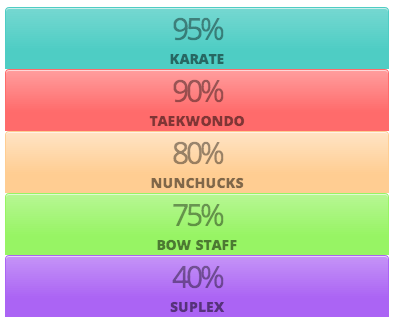
But, wait. If you see what we have so far, it just looks like percentages that are stacked vertically. Exactly. We’re styling this for mobile first, so that it is optimized for smaller screens. That’s why we’ve styled the list items with display: block.
Next, we removed the axis for the time being so it is hidden on small screens. There’s just no room for it, but we’ll introduce it back in when we progressively enhance the bar chart for larger screens.
Finally, we gave the percentages inside each bar some styling. Note the opacity. This will look just lovely when we give the bars a splash of color. Promise.
Color things in a bit
Let’s add some color classes so our chart pops. Basically, we’re adding a color class to each list item a div for both the percentage and the skills that acts as the labels for the bar. Naturally, we’re creating a different color class for each one, but the example below illustrates “teal.”
...
95%
Karate%
...
...
.chart .teal {
background: #4ecdc4;
background-image: linear-gradient(#76d8d1, #4ecdc4 70%);
border: 1px solid #4ecdc4;
}
.chart span { font-size: 30px; }
...
Note that we’ve styled the height of the bar inline rather than in the CSS. We could simply specify the height in the color class for each bar, but I find the inline route to be a little easier to maintain, though I typically loathe inline styles and avoid them like the plague.
Lastly, note the span tag around the percentage character. We’re going to style these separately, keeping the font size small while the numbers get larger. Just a neat stylistic thing.
Now let’s make it responsive
Up to this point, we’ve created something that looks neat but is far from looking like a traditional bar chart:
Let’s add our media queries for tablet and desktop. These may vary for the site you are building.
@media (min-width: 700px) {
.chart {
background: url("http://cl.ly/QSpc/bg-chart.png") right top repeat-x;
height: 425px;
margin: 0 auto -32px;
}
.chart li {
display: inline-block;
height: 425px;
margin: 0 1.8% 0 0;
width: 14%;
}
.chart .axis {
display: inline-block;
}
.chart .percent {
font-size: 40px;
position: absolute;
}
.chart .skill {
bottom: 20px;
font-size: 16px;
position: absolute;
}
}
@media (min-width: 1000px) {
.chart .percent {
font-size: 62px;
}
}
What did we do? We changed the orientation of the list items to stack horizontally on larger screens using inline-block and set the height of the chart container to 425px. Remember those inline styles? This is what they are measured against, giving each bar its height relative to 425 pixels. We also introduced a background image to the chart. I know this is supposed to be a pure CSS bar chart, but having a repeating background that provides the horizontal lines across the chart is the only way I could think to create that effect. Maybe someone smarter than me will find a better way and let me know (wink, wink).
[codepen_embed height=”268″ theme_id=”279″ slug_hash=”apukc” default_tab=”result”]See the Pen Responsive CSS Bar Graph by Geoff Graham (@geoffgraham) on CodePen.[/codepen_embed]
Additional Resources:
7 Comments
how easy is it to make it horizontal and with 2 axis (left and right)
Hi James,
Sounds like that would be pretty simple. Basically, we’d just be rotating the display of the chart, so that means our widths and heights get reversed as well as our positions, paddings and margins. Basically, everything with a number. :)
The key point is to make sure the .chart li is based on width instead of height in both the CSS and the inline styling.
Finally, I used a background image for the axis, so that would need to rotated so the lines are pointing up and down instead of left to right.
Please fork my chart on CodePen and let me know what you come up with. I’d love to see you work!
[…] Creating a Responsive Bar Chart A step-by-step for how I made the graph on my About page […]
I seem to be having some confusion attempting to modify this into a horizontal bar graph :/
The design for this is definitely better vertical.
Try this one for a horizontal layout: https://geoffgraham.wpengine.com/css-bar-chart-using-html5-progress/
The design for this is definitely better vertical.
Try this one for a horizontal layout: https://geoffgraham.wpengine.com/css-bar-chart-using-html5-progress/
You are right but it still fits exactly what I need, so thanks!
Comments are closed.